brief
The Public Record Office of Victoria manages the archives of the State Government of Victoria in accordance with the Public Records Act 1973. In 2017 PROV undertook a website redesign which included the creation of a new backend categorisation of their catalog and an online ordering and management system. The objective of this brief was to design a UX and UI that would provide archival researchers and amateur historians with a user-centric dashboard so that they can order, pay, organise and annotate lists of records. Users should also be able to plan and manage practical tasks such as visiting records, managing the records they have ordered, and other functionality as defined in the project.
Butterfly was engaged to provide a unified experience across all areas of development and the existing website. As a key measure of success, the experience had to drive more conversions from all users while also minimising friction between touchpoints.
approach
The project began with a user discovery which included one-to-one interviews with professional and amateur archivists, as well as university students and other academic personnel who regularly access the state archives. The purpose of these interviews was to uncover common behaviours throughout this cohort. As a result of our interviews, we determined two main pain points of time management (researchers are generally time-poor), and frustrations caused by inaccurate ordering or location status of archival records. This, along with a familiarity with e-commerce and account / order management systems, helped identify an area of focus for a design solution.
Using this knowledge, Butterfly was able to create a system that resembled current e-commerce platforms while accounting for the unique characteristics of the archival material and access regulations. By providing users with a clear indication of the order status of an archive, as well as the time remaining on current orders, they were better able to manage their time and expectations for receiving desired records.
Through thorough user testing of the solution, Butterfly was able to confidently state that the designed system would meet their users’ needs.
Butterfly gathered a variety of user experience artifacts during the process, as well as held regular face-to-face meetings at PROV’s offices to ensure face-to-face collaboration.

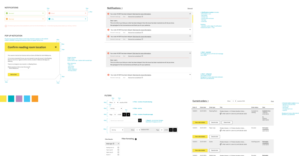
UX ARTIFACTS
- Research findings (raw data, interview transcripts etc) as well as key insights
- Feature prioritisation matrix
- User flows / journeys
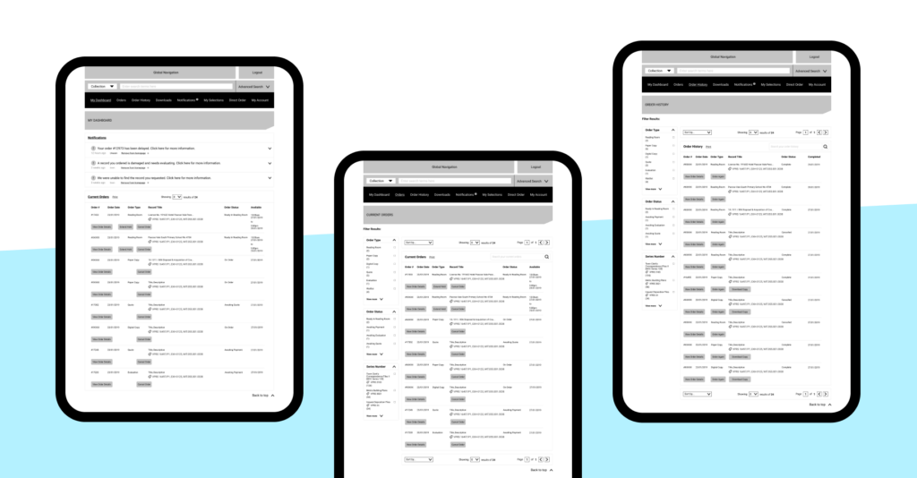
- Wireframes
- Interactive prototype

outcomes
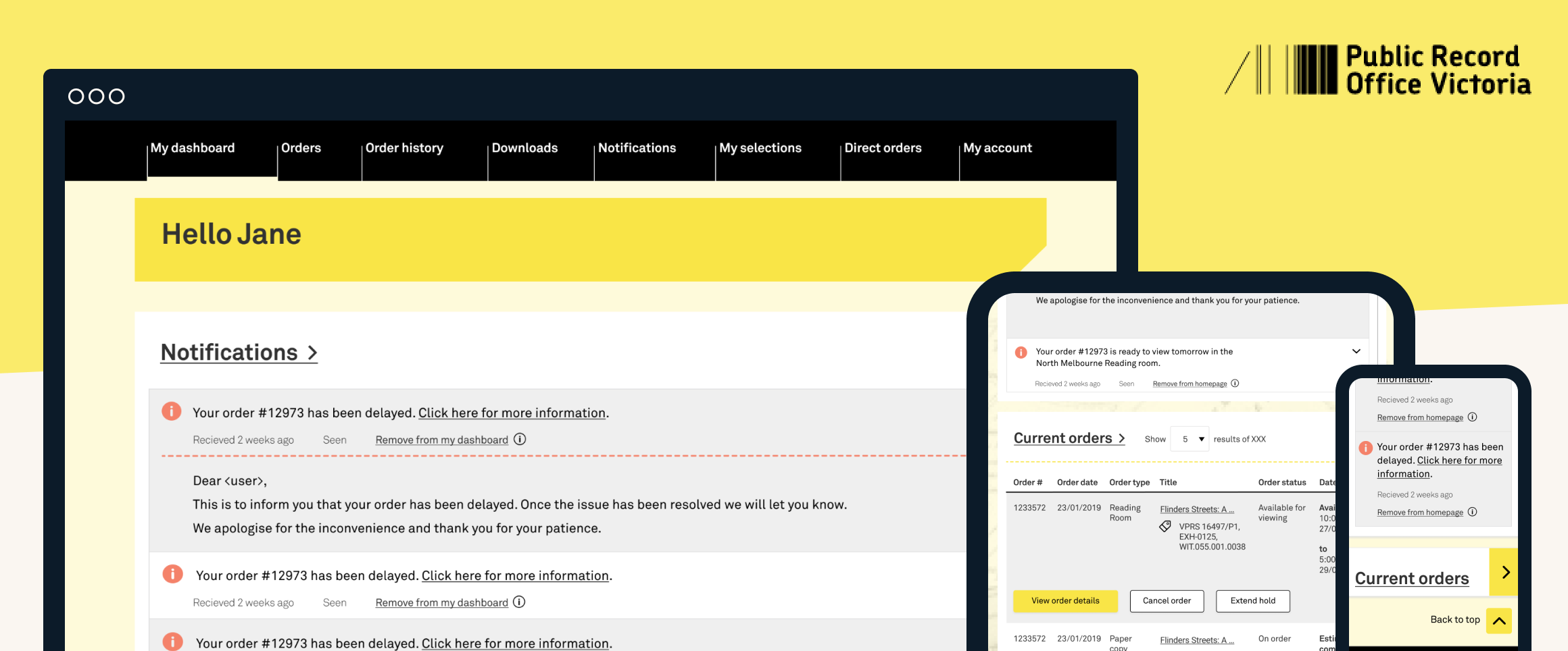
The end result of this project was a user-friendly and considered record management and ordering system for the amateur and professional researchers alike, supporting PROV’s goal of providing a seamless digital experience for anyone who wants to access records.
- An online system for ordering a product from end to end (Search to Receipt of Product, with a seamless user experience and a user interface that aligns with the new website branding.
- Design of a user dashboard enabling all researchers to manage orders (including quotes), review order history and manage researcher activities such as notations and flagging of records. and Order History Requirements
- A seamless system that utilises and enhances the newly designed website, elevating PROV’s offerings and providing a better, smoother experience for anyone needing to search for, and order and pay for access to a record.


