brief
Planning Institute of Australia (PIA) is the national body representing Australia’s planning professionals. Through education, communication and professional development, it is the pivotal organisation serving and guiding thousands of planning professionals in their role of creating better communities. Their previous website was facing a huge problem, it had too much content trying to serve too many different audiences.
PIA required a full website redevelopment, however they needed to continue to use their current CMS as it is integral to many business processes. PIA initially engaged Butterfly to conduct user research and a full user experience review of their site and integrated systems. They were so impressed with the work that we continued the collaborative relationship to design essential process flows and the user interface for the new website, redefining and developing it to become industry-leading and to inspire growth in the planning community.
approach
DISCOVERY
Butterfly began the discovery phase with a competitor (a detailed analysis of competitors related to the objectives as well as indirect competitors) and a heuristics analysis (a method used to gain knowledge on how to improve the website's user experience). We compared the results and gathered insights to build a foundation where the new site meets and exceeds industry standards while alleviating any existing pain points.
Working closely with PIA, Butterfly were able to identify key internal and external user groups for one-on-one interviews, which yielded a range of focus areas for UX design. From this, we found that users wanted a simplified sign up and renewal process, as well as a better way to record and track their continuing professional development (CPD).IDEATION
Once we had a good idea of the problem we were trying to solve, and what features were a priority we were able to move to the prototype design validation and IA / sitemap analysis phases. As a result of these phases, we developed prototypes that incorporated key features and then tested our assumptions with PIA stakeholders. Participants were given standardised instructions that included specific, high-value goals — in between sessions, the design team iterated the prototype, rapidly learning and designing to create a user-centric experience. This stage of testing was crucial to understanding how users interact with the website, as well as identifying potential navigation problems.
CONTENT DESIGN
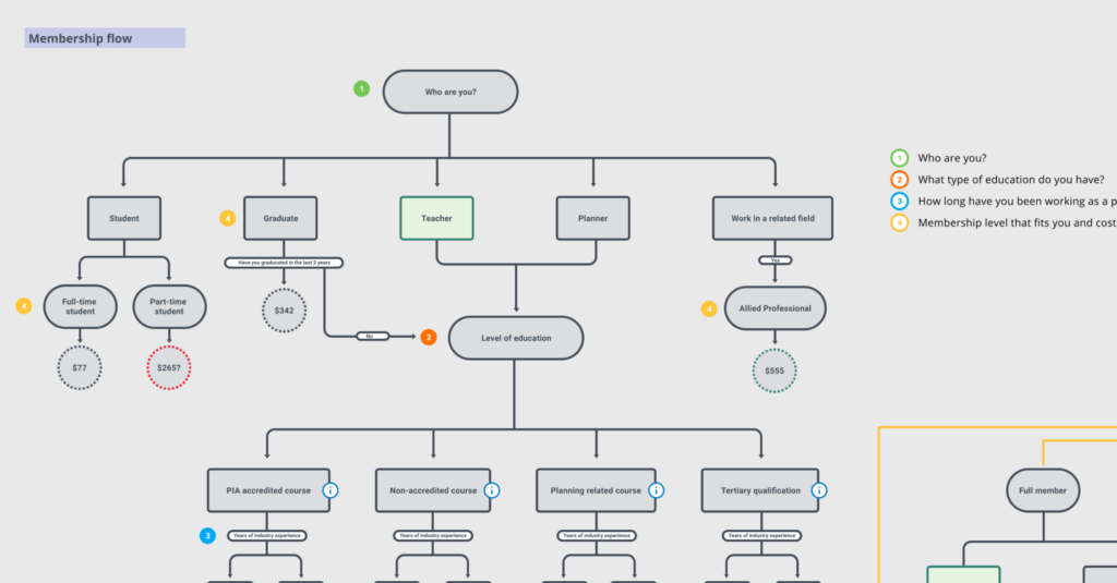
Once the groundwork was complete we could move to the content design phase. Based on the current and user research, we developed wireframes and user journey maps for key processes to ensure the new website accommodates both first-time visitors and return visitors.
USER INTERFACE DESIGN
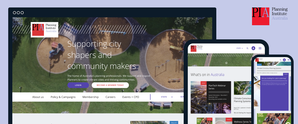
Now that the user experience part of the project had been completed, we could move seamlessly into the website's UI. As part of the design workshop, we gained a better understanding of the client's needs and PIA aesthetics so we could deliver standard internal elements as well as a dedicated homepage, members area, and event registration page.
Butterfly's engagement was limited to offering UX and UI suggestions for the site, and we had to adhere to the complex requirements of PIA's CMS. The key to delivering a solution that was contemporary was collaboration, both with PIA and their technical partner. Throughout this process, we maintained a collaborative and transparent relationship with PIA and the other technical partners to deliver a functional, usable, and well-considered user experience.
PIA have continued to engage Butterfly for visual design work in the period since completing this work.outcomes
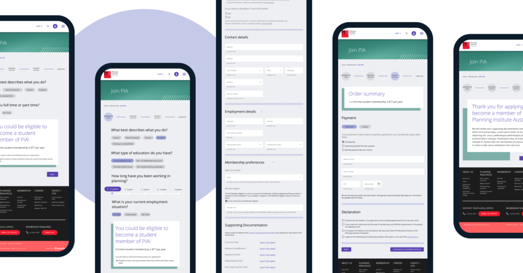
Butterfly’s research activities resulted in a number of key insights and core considerations for PIA’s team. These were implemented to provide an elevated user experience, from searching for the right educational event to tracking CPD points within the membership portal and a streamlined step-by-step membership wizard that helped potential new members navigate the tricky membership levels.
One of the key insights and solutions was creating a content structure so that each page could be personalised for the user, either by location or based on their login preferences. As a result, state branches can deliver state-based messages to their audiences without worrying about creating noise for their users.
- Conducting qualitative and quantitative discovery research to identify who uses the site, their intentions when using it, the primary tasks they’re trying to complete and the content they’re trying to find.
- Creating a revised new IA that we tested and validated through card sorting and tree testing.
- Delivering an online membership wizard that helps potential new members navigate the complex membership levels.
- A contemporary user interface that builds on the limited brand guidelines
