
As the web has evolved, users have become more sophisticated. The demand for user-specific content has increased. More and more we want to access information on the go -from our couch to our car. We expect relevant and valuable information to be served straight up, and it should be easy to understand and designed to enhance usability.
As a result, content strategy and information architecture (IA) have become more important than ever if organisations want to create a great user experience for their audience.
Ensuring content is tailored to the needs of the user is the first step in the process. This is achieved through a comprehensive information gathering process; uncovering the requirements, user stories, functional specifications, basic wireframes and prototyping.
Constant revision during this phase will provide you with a deep understanding of your user groups, enabling you to create an experience that places their needs at the forefront of the website.
Below are two recent website re-developments that have applied this user-centred approach to their content strategy:
VIC ROADS
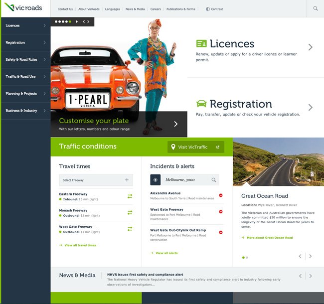
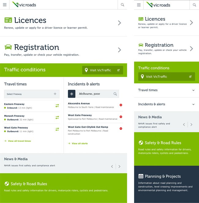
During the research phase of the new Vic Roads website, it was discovered a whopping 40% of users were accessing the website on their mobile devices. A conscious effort was made to re-write content in a mobile first approach and the result is a more streamlined experience across desktop and mobile devices. We can clearly see the two most popular areas of the site are Licenses and Registration, giving the user this information up front enables a far better user experience than previously having to hunt for it amongst droves of less important content.
BUSINESS VICTORIA
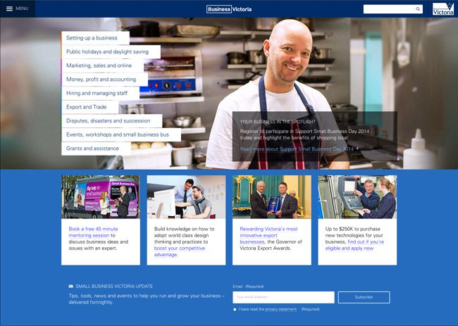
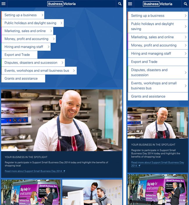
Business Victoria is another fantastic example of user-centred design. BV were inundated with calls from customers needing help navigating the website. Mobile web traffic had increased 450% in the past 12 months. Their digital agency conducted numerous interviews with business owners to identify their individual needs, working with them throughout the planning and design phase to ensure the outcome was citizen-centred. The result is a unique and truly effective online resource.The main menu is clearly labelled with popular options, asking users to select their special interest area and then following through with content that is tailored to them.
Knowing your end user is key to delivering an effective online experience. Understand what it is users wish to achieve and provide it to them upfront, this will allow them to complete tasks with as little fuss as possible.
Hot tip: Looking at your Google Analytics user flow section will help you ascertain where your users are going – and where they are dropping off.


