What is Responsive Web Design?

How to Make a Responsive Website: The Basics
The key to building a successful, responsive website lies in UX/UI design fundamentals. Following the basics of responsive design, you can create a website that engages users, regardless of whether they access it on a desktop, tablet, or smartphone.
Mobile-First Approach
Start designing for mobile versions first, focusing on the most important content and features. This guarantees a simplified user experience on tiny displays, making scaling for bigger devices easier.
Flexible Grid System
Make use of a flexible grid that can adjust to different screen sizes. Fluid layouts enable your website's elements to retain a uniform design and proportionate scale.
Flexible Images
To prevent image overflow or small sizes, use CSS techniques like max-width: 100%. This helps images resize proportionally based on screen size. This keeps your image from getting too large or too tiny.
Media Queries
Media queries are CSS codes that allow you to adjust the appearance of your website depending on the size of the screen your customer is using. This means you may change the text size, picture size, and other design aspects to make your website simpler to see and engage with. Use max-width settings to identify when a device is large enough to warrant a breakpoint, then create query breakpoints where the layout and design change to accommodate different screen dimensions.
Responsive Images and Videos
Larger picture and video files might slow down your website's loading speed, which can annoy users and increase bounce rates. Responsive images and videos allow you to display high-quality media that correctly scales based on the user's screen size while minimising load times.
Quality Assurance (QA)
Similarly to developing any website, there should be steps to ensure QA testing is done throughout. With responsive websites, cross-browser compatibility should be included, along with checking the consistency on different devices. This will help you identify and fix any layout or functionality issues.
Understanding Responsive Breakpoints
Responsive breakpoints are the points at which a website’s layout changes in response to a screen size or resolution change. In other words, it’s the moment at which the content changes depending on the device being used to view it. By implementing responsive breakpoints, your website can adapt to different screen sizes, ensuring that users have a seamless experience across all devices.
Designers and developers use several common breakpoints when creating responsive websites. The most common are 320px, 480px, 768px, 992px, and 1200px. The 320 pixels breakpoint is typically used for small device classes, like mobile phones and iPods. The 480px breakpoint is for slightly larger mobile devices like phablets or small tablets, while the 768px breakpoint is for larger tablets or small laptops. The 992px breakpoint is used for regular laptop and desktop computers, and the 1200px breakpoint is for large desktop displays.
Designing for breakpoints requires a thoughtful approach that considers the content and user experience. Rather than designing for specific device sizes, it’s essential to create a flexible layout that can adapt to any screen size. When designing for responsive breakpoints, consider the flow of your content, your typography, and the use of images. Ensure your website has enough white space and your typography is readable on smaller devices.
Responsive Web Design Examples
Be Agile
Successful companies and businesses prioritise their users’ experience by ensuring their website is optimised across all devices. Here are some of the websites that showcase responsive web design: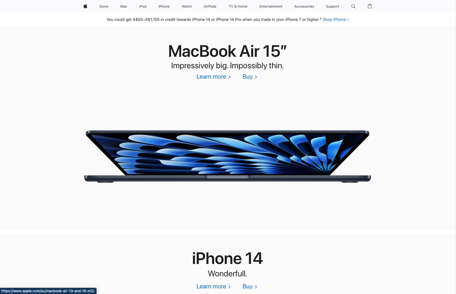
Apple
Apple's website is a prime example of responsive design because it's optimised to work on every device. It doesn't matter if you're browsing on a desktop, laptop, tablet, or phone—the site looks great no matter what device you use.
The layout structure is simple, with a menu bar across the top that lets you access the different sections of the site (store, search bar, support, etc.). There aren't too many irrelevant elements; instead, the focus is on showcasing their products and making it easy for customers to navigate and find what they want.
Starbucks
The Starbucks site adjusts its layout based on the browser size it is being viewed on. The site has a two-column layout on a desktop device with an image and content on both sides and a website navigation menu above. On a cell phone, the layout changes to a single column with the hamburger navigation menu at the right side and the contents are at the bottom, making it a single-column layout.
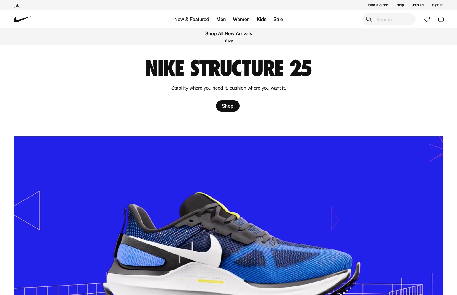
Nike
Nike uses a mobile-friendly navigation menu for mobile devices. The typical horizontal menu has been replaced by a hamburger icon that expands into a vertical menu when pressed. It has a combination of two-column and three-column content layout on the desktop version and is transformed to a single-column design when viewed on a handheld device. This design strategy enables visitors to explore the website effortlessly on smaller displays without losing usability.
Choosing Between Responsive vs Adaptive Web Design
Responsive breakpoints are the points at which a website’s layout changes in response to a screen size or resolution change. In other words, it’s the moment at which the content changes depending on the device being used to view it. By implementing responsive breakpoints, your website can adapt to different screen sizes, ensuring that users have a seamless experience across all devices.
Designers and developers use several common breakpoints when creating responsive websites. The most common are 320px, 480px, 768px, 992px, and 1200px. The 320 pixels breakpoint is typically used for small device classes, like mobile phones and iPods. The 480px breakpoint is for slightly larger mobile devices like phablets or small tablets, while the 768px breakpoint is for larger tablets or small laptops. The 992px breakpoint is used for regular laptop and desktop computers, and the 1200px breakpoint is for large desktop displays.
Designing for breakpoints requires a thoughtful approach that considers the content and user experience. Rather than designing for specific device sizes, it’s essential to create a flexible layout that can adapt to any screen size. When designing for responsive breakpoints, consider the flow of your content, your typography, and the use of images. Ensure your website has enough white space and your typography is readable on smaller devices.
What's the Difference?
Responsive design adjusts to different screen sizes using flexible and fluid layouts. It uses relative units, fluid grids, and CSS media queries. One codebase and set of HTML and CSS are used across all devices. The design elements and content change based on screen space to ensure a good user experience. Responsive design works on larger screens and small mobile devices, keeping consistency and readability.
The adaptive design creates different versions of a website for different device types. It detects the characteristics of the user’s device and serves an appropriate version of the website. Adaptive design can involve HTML, CSS, and server-side components. It optimises content and design for each version to provide a better user experience. Adaptive design tailors the experience to device capabilities and provides optimised performance.
Pros and Cons
Responsive Web Design
Pros
- The layout and content of a website automatically adjust to fit different screen sizes, ensuring consistent user experience across all devices.
- The responsive design saves money and time using one codebase instead of creating separate versions for different devices.
- Updating and maintenance are simple because there is just one code and content set to manage.
- Responsive design makes your website accessible as technology evolves.
- A mobile-friendly website can boost your SEO efforts because search engines prefer responsive sites in their rankings.
Cons
- Responsive website design provides less customisation and optimisation for specific devices than adaptive design.
- Loading the same code and content on all devices may cause slower page load times. This is especially true for smaller devices with limited bandwidth.
- Different screen sizes may require flexible layout compromises, sacrificing some design elements or visual precision.
- Responsive design has limitations in tailoring user experience for individual devices or using specific device capabilities. This means less control over the design.
Adaptive Web Design (AWD):
Pros
- Adaptive design enables customisation and optimisation for specific devices. This improves performance and user experience.
- Adaptive design allows for better control over visual presentation and layout on various devices. Separate versions of the website can also be created for this purpose.
- Serving device-specific versions can result in faster load times and improved performance, as content and design are optimised for each targeted device.
- Adaptive design allows for the integration of device-specific features and capabilities to provide an optimal experience.
Cons
- Creating and maintaining several versions of a website requires additional time, resources, and frequent adjustments for each version.
- Developing and maintaining several versions might be more expensive than responsive design.
- Having separate versions of a website can cause fragmented analytics and SEO. Each version may need separate tracking and optimisation, resulting in a lot of extra work.
- The adaptive design may become outdated as new devices and screen sizes emerge, making it less future-proof than responsive design.
Discover the Value of Responsive Design with Butterfly
At Butterfly, we take pride in being a leading web design agency in Melbourne, offering top-notch responsive design services tailored to your unique business needs. Our designers and developers know how important responsive design is for user experience. We use modern techniques to make websites adapt to different screens effortlessly. Our expertise ensures your website looks great and works well on desktops, tablets, and smartphones. We use the latest technologies to optimise loading times, navigation, and content delivery, so your users are engaged and happy while browsing your site. Discover the value of responsive design, and let us elevate your online presence to new heights. Contact Butterfly now!
Responsive Web Design FAQs
What are the benefits of having a responsive website?
How do I know if my website is responsive?
Can I convert my existing website into a responsive website?
What are some common mistakes to avoid in responsive web design?
You may develop a responsive website that gives an ideal user experience across devices, increases performance, and fulfils the demands of your target audience by avoiding these frequent mistakes:
- Not thoroughly testing your responsive design on various devices and screen sizes.
- Focusing solely on desktop design and neglecting mobile optimisations
- Overloading your website with excessive content or cluttered layout elements.
- Failing to optimise your responsive website for performance.
- Neglecting touch interactions and designing solely for cursor-based devices.
- Ignoring accessibility guidelines.
- Ignoring SEO best practices.
- Failing to gather user feedback.