Embracing Minimalism for Effective Web Design
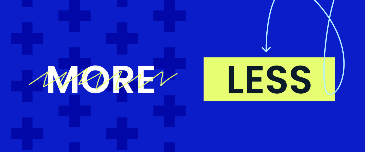
When it comes to website design, less is definitely more. Imagine walking into a clutter-free room where you can effortlessly locate your needs. That’s what a minimalist web design delivers — a clean, fresh, and user-friendly space on the internet. It eliminates the distractions, focusing solely on essential elements. This not only creates a visually engaging environment but also improves the website’s user and performance experience.
Key Principles of Minimalist Website Design
A minimalist website design not only looks modern and sophisticated, it should also be simple to use. If you’re considering creating a minimalist website, here are some key principles to keep in mind:
Use Whitespace
The empty space between components on a webpage is referred to as whitespace or negative space. Use white background strategically to create a visual hierarchy. Increase the spacing between important elements to draw attention to them. This helps guide the user’s eye and prioritise the most essential content.
Flat Design
The flat design eliminates three-dimensional elements, like shadows and gradients, and focuses on simple, flat graphics. Flat design not only looks modern but also enhances the website’s loading speed.
Typography
Choose simple and easy-to-read fonts for your website. Stick to one or two fonts and stay consistent. Choose clean, crisp fonts that are easy on the eyes. This enhances the minimalist design and improves readability. Aim for harmony between style and function.
Limited Colour Palette
Minimalist websites use a limited colour palette of two or three colours. Avoid using too many colours because they can distract the user and create visual noise. Choose colours that complement each other and your brand to develop a sense of harmony on the website.
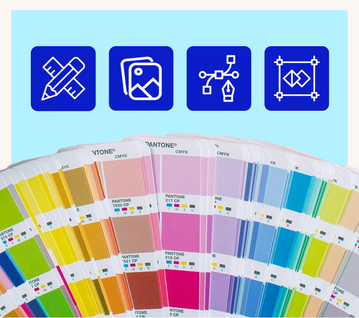
High-Quality Images
While a minimalist website focuses on simplicity, high-quality images can still be used to create visual interest. Select relevant and impactful images, but avoid overcrowding your design with excessive visuals.
5 Simple and Minimalist Website Examples
If you’re looking for inspiration for your own website or you’re curious about the concept of simplicity in web design, here are some examples of simple and minimalist websites with exceptional UX/UI design that can serve as a guide.
The New Yorker - newyorker.com
This classy publication masters the art of simple website design by keeping its layout clean, with a single dominant font and a limited red, black and white colour palette. The text-heavy site is balanced out by occasional images and cartoons, proving that minimalism isn’t just for the visually focused.
Medium - Medium.com
Medium’s website has a clean white background, clear typography, and a limited colour palette. The layout’s primary focus is user engagement. It minimises distractions, allowing readers to immerse themselves in articles and stories. It is also adaptable to mobile devices, enhancing the reading experience. Medium’s mission is to provide a user-centric and distraction-free platform for content consumption.
Tattly - Tattly.com
Tattly’s website has a minimalistic design. It showcases its temporary tattoo products with high-quality product images, clean typography, and a limited colour palette. This design reflects the simplicity of their offerings and creates a user-friendly experience. The simple layout and clear visuals make browsing and purchasing tattoos easy.
TED - TED.com
TED uses simple design trends to prioritise its mission of sharing ideas. The simple approach helps focus on content, makes it accessible, and makes navigation easy. It also maintains brand consistency with TED’s commitment to impactful storytelling. This design works for a diverse, global audience and shows TED’s dedication to simplicity and effective communication.
Stripe - Stripe.com
Stripe uses a minimalist, custom website design to improve user experience and show professionalism. The design is clean, with a white space and concise text. They also use carefully selected illustrations that match Stripe’s values and their financial services. By keeping the design simple, Stripe helps visitors understand what it offers. This simplicity also builds trust by showing transparency and reliability, which are essential in finance.
Benefits of Minimalist Website Design
Minimalist design has many advantages that can help businesses succeed online. Let’s take a closer look at these benefits.
Enhance User Focus and Clarity
With simplified visuals, minimalist design removes unnecessary elements like buttons or icons, leaving only essential content and visuals. This approach helps users quickly identify and focus on the primary message or purpose of the platform.
Clear Hierarchy
With a minimalist approach, it’s easier to establish a clear hierarchy of information. Important content can be emphasised through size, colour, or placement, guiding users through the website’s structure.
Faster Load Time
Minimalist websites tend to have fewer elements, translating to smaller file sizes. This reduces the amount of data that needs to be loaded, resulting in faster loading times, especially for visitors with slower internet connections or using mobile devices.
Improve Performance
With optimised code, minimalist websites enhance website performance by reducing the chances of code conflicts, errors, or compatibility issues across various devices and browsers.
Enhanced SEO
Websites that load quickly are preferred by search engines such as Google since they improve the user experience. This can lead to increased organic traffic and higher search rankings.
Web Design Tips for Achieving a Minimalist Aesthetic
Here are some essential tips to help you create a minimalist website:
Whitespace is Key
Use plenty of whitespace around elements to create an open and clear design.
Reduce Text and Content
Keep your message concise. Get rid of any text that isn’t necessary and divide the information into easy-to-read sections.
Maintain Visual Balance
To create a sense of order and symmetry, ensure the elements on your page are balanced and harmoniously aligned.
Minimalist Photos
Use images sparingly and choose ones that are high-quality and relevant. Opt for clean, simple visuals that complement your content without being overpowering.
Mobile-First Approach
Design for mobile users first. Minimalist designs work well on mobile screens, providing a consistent user experience on all devices.
Limit Colour Palette
Use only one or two primary colours and their shades for your colour palette. Choose neutral tones to keep a clean appearance.
Experience the Art of Minimalism with Butterfly's Guidance
With Butterfly as your trusted web design agency in Melbourne, we can help you craft digital experiences that embrace simplicity and elegance. You’ll get a team of experienced web designers who understand aesthetics and functionality. Contact us today to discuss your project that will captivate your audience and drive success for your business.