Here’s why you need a WCAG friendly digital design system
- 9 MIN Development, UI & UX Design
There is something very pleasing and comforting about consistency to us humans. We don’t just like the familiar, we love it. That’s one reason why as brands we don’t change our logo every week, or use 18 different fonts across our website.

A digital design system — the evolved brand style guide
Imagine you had 40,000 software developers and 10 designers working on one project, that’s the situation GE faced, in 2012. Now, imagine each of those designers and developers crawling through the company server to find a PDF, or even a link to the PDF. That’s when GE decided to build their first design system.
A design system makes an organisation design scalable and capable of evolution. So, when an organisation is releasing a new product or introducing new pieces of collateral or just anything requiring the brand touch the design system can be updated.
The system is also highly accessible and can live within the creative programs designers use, such as Photoshop and Sketch. It puts a brand right at our fingertips.
Then, there’s the shareability aspect helping to create brand consistency with clients, agencies as well as developers.
As the modern style guide there’s one thing we think it must have...
And, that’s accessibility guidelines.

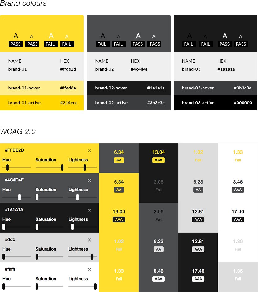
Choosing colours that contrast well is web design 101, but sometimes designers get wrapped up in creative flair and design for beauty, not usability. Stating web accessibility goals in your design system is a good way to ensure all users have equal access to your site. And, at the end of the day that means more people have a positive experience with your brand.
It’s not just colour either, sometimes fonts present a problem for accessibility, particularly as you switch between devices.
Every device comes with its own pre-installed fonts based on its operating system, whether it’s MacOS, Android, Windows etc.
So, if your designers are keen on a font that is not available across all operating systems, the system will default to its choice of font, which may impact readability and loading times on different devices.
The solution to this is to include a backup list of “web safe fonts” that appear across all operating systems in your style guide. This doesn’t mean the font will meet accessibility standards, but it does give you control over what font does appear, and you’ll hopefully choose a font that will be readable. We use Google fonts as much as possible because they render quickly and display well across all devices. It’s just a fail-safe, but it means more people will see your site as intended.
Want to see a digital design system?

If you’d like to know more about creating a digital design system or how to become WCAG compliant, please get in touch.
Like this article? Share with friends and colleagues

