Crucial Role of App Interfaces in User Experience (UX)
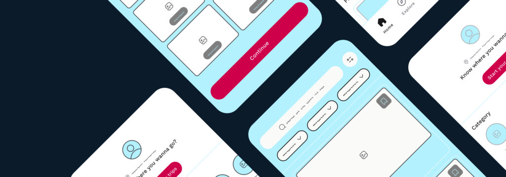
The app interface is the visual representation of the app. It includes layout, navigation, typography, action buttons, design elements, icons and graphics. As a bridge between the user and the app’s functionalities, a well-designed and intuitive app interface within the UX/UI design can significantly enhance the user experience and increase engagement.

Impact of Effective App Interface Design on User Engagement
The design of an app’s interface, including hosting and support, is key to keeping users engaged. When an app looks good and feels good, it draws users in and makes them want to explore more. Including games and challenges within the app generates interest and encourages frequent use. Users feel appreciated through the use of personalisation and interest-based recommendations.
Users are more invested in an app that uses engaging animations and transitions to create a story. Social features create a sense of belonging and connection. Speedy app responses contribute to a satisfying user experience. Overall, a well-designed interface turns an app into an enjoyable and immersive experience.
Understanding App Interface Design Principles
Key Elements of a Well-Designed App Interface
There are some key elements that must be included in any well-designed app interface. These include clear and intuitive navigation, minimalist design, responsive design for various devices, meaningful use of colour and typography, strategic placement of interactive elements, and a focus on user-centered design ideas. Each design element plays a role in making the app easy to use, visually appealing, and engaging.
Balancing Aesthetics and Functionality in App Design
While aesthetics play an important role in attracting users to an app, its functionality should never be compromised. It is essential to find a balance between visual appeal and practicality. Incorporating visually pleasing elements, such as attractive colour schemes, engaging visual design elements, and eye-catching animations, can enhance the app’s overall aesthetic. However, the primary focus should be on providing users with an easy-to-use and intuitive interface that serves its purpose effectively.
Importance of Consistency and Visual Hierarchy
Consistency and visual hierarchy are essential in app user interface design. Consistency means using the same design elements throughout the app. This helps users feel familiar and makes the app easier to use. Visual hierarchy helps organise content in the app. App designers can use cues like buttons, colour, and placement to guide users’ attention. This makes it easier to navigate the app and understand the most important elements and actions.
Tips and Best Practices for Application Interface Design
Here are some tips to follow to make your user interface as smooth and user-friendly as possible:
Keep it Simple and Intuitive
The interface should have a clean design and be clutter-free, allowing users to navigate effortlessly and find what they need. Avoid unnecessary interface elements and focus on intuitive design patterns that customers already know.
Consistency and Standardisation
Being consistent is important to avoid user frustration. Keep the layout, design, and interaction patterns the same throughout the application.
Prioritise Accessibility in Design
An inclusive interface design is crucial to cater to users with disabilities. Consider important accessibility options such as colour contrast, text size, keyboard navigation, and screen reader compatibility. Incorporate alternative text for images and provide captions for multimedia content.
Use Visual Cues and Visuals
Visual cues such as buttons, icons, and tooltips can help users understand the interface quickly. Use consistent and meaningful icons to represent actions or functions.
Load Time Optimisation
Optimise the loading time of your application to ensure a smooth user experience. Minimise the use of heavy images or unnecessary animations that may slow the loading speed.
Designing for Different Platforms and Devices
Adapting App Interfaces for iOS and Android
App designers need to understand and adapt to each platform’s different design guidelines and user expectations. iOS focuses on simplicity and clarity, while Android offers more flexibility and customisation. Designing for iOS and Android requires following their respective design guidelines – the Material Design guidelines for Android and the Human Interface Guidelines (HIG) for iOS. Each platform has its own visual language, navigation patterns, and interaction styles.
Responsive Design: Ensuring Seamless Experiences
Responsive design adjusts websites and applications to different screen sizes for a consistent user experience. Designers must consider fluid grids, flexible images, and media queries. A fluid grid resizes and repositions content based on screen size. Flexible images adapt to different resolutions without distortion. Media queries detect screen size and apply CSS styles accordingly.
Considering Device-Specific Capabilities and Limitations
Devices have different capabilities and limitations. Mobile devices have touchscreens, cameras, and accelerometers, while desktops have bigger screens and more processing power. Use these features to improve user experience. But remember, smaller screens may need simpler layouts, and not all devices may support certain features.
Conduct User Testing
User testing is important in design to validate mental models. By observing active users interacting with the design, designers can identify gaps between their intended mental model and the users’ understanding. Iterative testing and refinement ensure the design aligns with users’ mental models and meets their expectations.
Iterate and Refine
User testing is essential for validating design effectiveness. It involves observing users interacting with the design to identify gaps between their mental models and the designer’s intentions. Iterative testing and refinement are necessary to align the design with user mental models and meet their expectations.
Case Studies: Exceptional App Interface Designs
Case studies of exceptional app interface designs can provide valuable insights into successful design practices. Here are a few examples:
Spotify
The app’s interface design is centred around personalisation and discovery. The “Discover Weekly” playlist, tailored recommendations, and personalised playlists allow users to explore and enjoy music from various genres and artists easily.
Instagram is known for its visually appealing and intuitive interface and focuses on simplicity and minimalism. The clean layout allows users to share and explore images and videos easily. Consistent icons, straightforward navigation, and interactive elements have also contributed to its widespread popularity.
Duolingo
The app’s interface design is gamified, making the learning process feel like a fun and engaging experience. Its vibrant colours, clear visual hierarchy, and animated characters make learning enjoyable and easy to follow.
Airbnb
Airbnb has garnered a massive user base due to its user-friendly interface. The app’s design focuses on simplicity and ease of use. From the intuitive search function to the clear and concise booking process, every step is designed to provide a seamless experience for users.
Level Up Your App Interface Design With Butterfly
Imagine app interfaces that effortlessly guide users and leave a lasting impression. With Butterfly’s guidance, the leading app development agency in Melbourne, you’ll uncover the art of balancing aesthetics and functionality. Our expertise lies in transforming ordinary app interfaces into captivating journeys that users can’t resist. Take advantage of every opportunity; let’s transform your app interface into a masterpiece together!
App Interface FAQs
What are some common design mistakes to avoid in app interfaces?
Here are some common design mistakes to avoid when creating app interfaces:
- Overcrowding screens with too many elements.
- Using inconsistent colours, fonts, and styles.
- Using poor typography that’s hard to read.
- Excessively using pop-ups that disrupt the experience.
- Hiding important features deep within the app.
- Failing to test on various devices and screen sizes.
- Disregarding user feedback and suggestions.
How can I ensure my app interface is accessible to all users?
Follow these steps to make your app accessible to all users, especially those with disabilities.
- Learn and follow accessibility guidelines like WCAG for best practices.
- Use descriptive alt text for images, enable keyboard navigation, and choose readable fonts with appropriate sizing.
- Maintain colour contrast, provide clear focus indicators, and label forms correctly.
- Include captions and transcripts for multimedia content.
- Test your app with assistive tools and users with disabilities.
How can I conduct user testing for app interface design?
User testing for app interface design involves setting goals, recruiting various participants, creating realistic scenarios, and observing how they interact. This process uses methods such as in-person or remote sessions to gather valuable feedback by encouraging participants to perform tasks and share their thoughts. The analysis of their behaviour and feedback helps identify patterns of both challenges and successes. With these insights, you can refine the app’s design and functionality, continuously testing to enhance the overall user experience.


